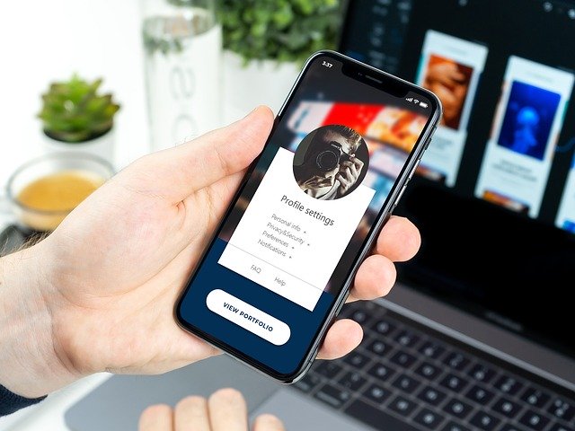
Email Marketing for mobile – the stats don’t lie, most of your email marketing is going to be read on mobile. In 2020 you can expect anywhere up to a 90% read rate from mobile devices.
With this data in mind, we need to give consideration to the design of our email and how it will render on mobile devices. Designing for a desktop user with a 28” screen is one thing, but mobile with a 5” screen means that we need to give completely different consideration to the design of our email marketing.
Keep Content Concise
When your email is read on mobile, chances are your subscriber is having a quick browse of your message, not in in-depth read. Your subscriber may be out and about, or at home having a quick browse of their inbox while watching the TV.
Taking this into account, you don’t have the opportunity to write a long email or sales pitch. Big blocks of text simply won’t get read. In fact, big blocks of text will normally put a subscriber off from interacting with your mailer, resulting in lower engagement rates.
As a rule of thumb, keep your mailer; brief, concise and to the point.
Pro-Tip
After initially designing your mailer, don’t send right away. Give it 24 hours. With a fresh set of eyes, audit every block of text on your email campaign, trying to work out how you can make it more concise and to the point. Remove any fluff and waffle.
Place Your Call-To-Action Before The Fold
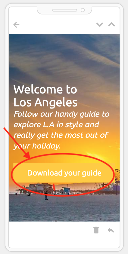
The call to action of your campaign is always the most important part. It is the button that you want a subscriber to click on, it is the video that you want a customer to play or the telephone number that you want someone to call.
A hidden Call-To-Action or no clear Call-To-Action is the hallmark of a failed email marketing campaign. If a subscriber can’t quickly identify the purpose of your email, it will be quickly confined to the trash can.
When your subscriber opens your email. The call to action should always be prominent and easily accessible. If the user has to scroll down to see your Call-To-Action, chances are it will be missed. For this reason, we always advise that your call to action should be ‘before the fold’, so visible on screen without having to scroll down or swipe.
When optimising for mobile, your Call-To-Action needs to be that much higher. Your design should take into account the limited space on a mobile screen, with less information being readily visible before the user has to scroll down.
Watch Your Image Sizes
We all use images on email, an image helps bring the email to life and illustrate a product or service. On mobile, we need to give consideration to the size of your images, both in terms of file size and pixel size.
File Size
Always optimise your images for the web. By that, we mean that the file size should not be huge. As a rule of thumb, aim to keep all images below 100kb in size. There are some great free online optimizers such as TinyPNG that will do it all for you.
An image that is several MB in size will take too long to download to a subscribers mobile phone. If the image is slow to load, chances are that your subscriber won’t wait. They will delete your email and move on.
Pixel Size
The Pixel size of your images should also be considered for mobile. On the desktop, your huge banner that looks fantastic on a 28” screen may look awful on a 5” mobile.
Pro Tip
If you are an email blaster user and using our drag and drop builder. The builder will automatically aim to optimise big images for display on mobile devices.
We would always recommend previewing your mailer on mobile before sending. Spend a few minutes double-checking that your stunning image-based mailer still looks stunning on mobile and does not leave your subscribers scratching their head at only being able to see the front wheel of your stunning new car leasing offer photo.
Check Mobile Rendering
Following on from the previous point, always check how your email renders on both mobile and desktop. This does not mean that you need a draw full of every iPhone/Android ever made – that would ridiculous, leaving your office looking like a Carphone Warehouse store.
As an Email Blaster user, we recently added support for mobile testing.
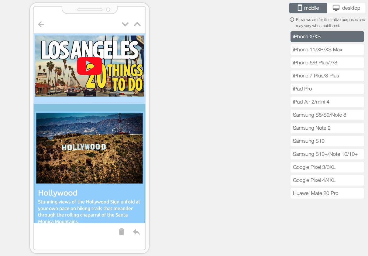
(Inside the drag and drop builder, click on the Action menu and select ‘Inbox Preview’).
We have put together inbox testing for the most popular and widely used mobile phones. Taking into account various phone screen sizes, you can quickly preview how your mailer will render on anything from an iPhone 11 to a Google Pixel.
The handly free tool will allow you to quickly diagnose any rendering problems on mobile before sending.
Email Marketing For Mobile In 2020
As time goes on, more and more of your subscribers will be reading your email marketing on mobile devices. Gone are the days where that dial-up modem sings under your desk and mobile is only accessible on a desktop.
Your email marketing in 2020 needs to be designed with mobile in mind. Mobile reads are now at the point of overtaking desktop. This means that we need to keep your mailer; short and to the point with well-optimised images and a clear Call-To-Action that does not leave our subscribers scratching their head at frustration.
Join Email Blaster Free.
Made right here in the UK by us, Email Blaster is free to try. If you are not yet using Email Blaster to grow your business. We offer both Pay As You Go Email Marketing and a Free demo account. Find more about our email marketing services here.


