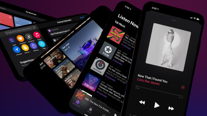
Designing emails for Apple’s Dark Mode involves optimizing your email content and styling to ensure a seamless and visually appealing experience for users who have Dark Mode enabled on their devices. Here are some tips for designing emails with Dark Mode in mind:
- Use Dark Color Schemes:
- Opt for dark colour schemes to align with the visual aesthetics of Dark Mode. Use dark backgrounds, text, and other elements to create a cohesive and pleasing look.
- Adjust Image Contrast:
- Darken or adjust the contrast of images to ensure they blend well with dark backgrounds. This helps prevent images from appearing too bright or out of place in Dark Mode.
- Responsive Design:
- Ensure your email design is responsive and adapts well to various screen sizes and orientations, as users may switch between Dark Mode and Light Mode on different devices.
- Test in Dark Mode:
- Test your email design in both Dark Mode and Light Mode to identify any issues or inconsistencies. Pay attention to text readability, image visibility, and overall aesthetics in both modes.
- Text and Font Choices:
- Choose fonts that are easily readable in both Light and Dark Modes. Ensure sufficient contrast between text and background to maintain clarity. Light-colored text on a dark background or vice versa is commonly used.
- Use Transparent Backgrounds:
- Consider using transparent backgrounds for images or graphics. This can help them seamlessly blend into the dark email layout.
- Check Branding Elements:
- Review your logo and other branding elements to ensure they look good in Dark Mode. Adjust colours or consider providing alternative versions optimized for Dark Mode if needed.
- Dynamic Content for Dark Mode:
- Some email clients support dynamic content that adapts based on the user’s mode preference. Explore whether your email marketing platform provides features for creating dynamic content for Dark Mode.
- Avoid Heavy Background Images:
- Heavy background images might not render well in Dark Mode. Keep background images simple and ensure they don’t negatively impact the overall readability of your email.
- CSS Media Queries:
- Use CSS media queries to customize styles specifically for Dark Mode. Many email clients, including Apple Mail, support media queries that allow you to apply different styles based on the user’s preference.
- Provide a Light Mode Option:
- While designing for Dark Mode is essential, consider offering a light mode option for users who prefer the traditional look.
- Alt Text for Images:
- Include descriptive alt text for images to provide context even if images are not displayed. This is good practice for accessibility and remains important in both Dark and Light Modes.
Always test your email campaigns across various devices, email clients, and modes to ensure a consistent and visually pleasing experience for all users. Keep in mind that Dark Mode support can vary across different email clients, so staying informed about the latest updates is crucial.


