This one we have kept a little quiet about, but over the last few months our lovely coders and designers have been hard at work designing the latest release of your email marketing software; email blaster version 4.0.
Inside the new email blaster, we have completely re-designed the interface – offering a fresh new look and feel.
If you are used to using version 3.0, don’t worry – we have kept the workflow largely the same – so you should feel at home within your new email blaster right away.
What’s new inside version 4.0?
Faster.
The previous version of email blaster was pretty fast, but we have made version 4.0 even faster. Email blaster’s main interface code is now 48% smaller than the previous release. This means that your browser has less to do – so can load your software even faster than before.
A new dashboard.
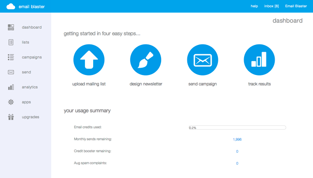
The dashboard, the home area for your software. We have given this area a new look. We have removed un-necessary furniture, just leaving what’s important. Quickly monitor the health of your software and navigate to your main user areas. The clutter has gone.
Beautiful new navigation.
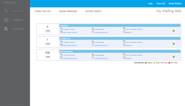
Your email blaster should be easy to use and get around. For this reason we have designed a beautiful new navigation system. Selecting ‘lists’ from the main menu triggers the new slider menu to slide in from the left of your software.
The navigation system has been given more room to find what you want and find it quickly.
Analytics.
The stats centre has now been re-named, we call it Analytics. This is your port of call to quickly track the success of your email marketing campaigns.
This area has not just been re-named, we have also given it a sexy new facelift. When entering the analytics for your latest campaign, a clean easy to follow navigation bar appears at the top of the page. When scrolling down the page, this navigation bar stays static, allowing you to quickly find what you want where ever you are. Moving the navigation bar to the top of your screen, gives extra room to show what counts, larger clearer graphs and campaign statistics.
The links clicked monitoring area has also been tweaked. Monitor link click volume via a great looking new line graph.
Upgraded Frameworks.
Email blaster is proud to unleash the power of jQuery to power parts of the interface. Your software has now been upgraded to the latest release – incorporating bug fixes and performance increases.
Content Windows.
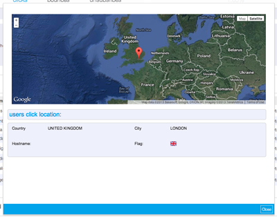
From time to time additional content will appear in new windows; previewing a campaign, searching for a contact and geo-locating emails. With version 3, we had previously used an external plugin for this – we thought the source code was too big, slow and clunky. For this reason we have designed our own plugin; VideoBox.
VideoBox is small, lightweight and looks great. It allows additional content to load quickly and reliably. With VideoBox you can also move the window around the screen, nothing is fixed. This allows you to carry on working; moving the window out the way to see data behind.
Lists.
Previously called ‘Mailing Lists’, now simply called ‘Lists’. This area of your software has also been given a new interface.
We have moved the navigation bar to the top of the page, this allows extra room to see your mailing lists. When scrolling down, the new navigation bar remains static at the top of the page, this allows you to quickly find what you want wherever you are.
Contact Search has also been moved to the Lists navigation bar at the top of the screen. Clicking ‘Contact Search’ instantly opens the search box, powered by our new lightweight VideoBox plugin.
Campaigns.
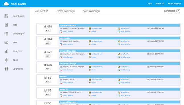
Like Lists, campaigns has also been treated to a tweaked slicker interface. Again we have moved the navigation bar to the top of the screen, giving extra room to list your great looking email campaigns. The navigation bar remains static at the top of your screen.
List Doctor.
The List Doctor has been supercharged. Your de-dupes, data cleans and other services performed by the doc now runs 70% faster.
We really hope that you love email blaster 4 as much as we do. The fresh new interface will make using your software even easier than before. Feedback so far has been great – but that’s not everything…
cBuilder 2.0 is just around the corner!


